Project Overview
Bridging Two Brands for Hope Fund Week
Client: HCA Healthcare Internal Hope Fund Team
Type: Campaign Design + Brand Integration
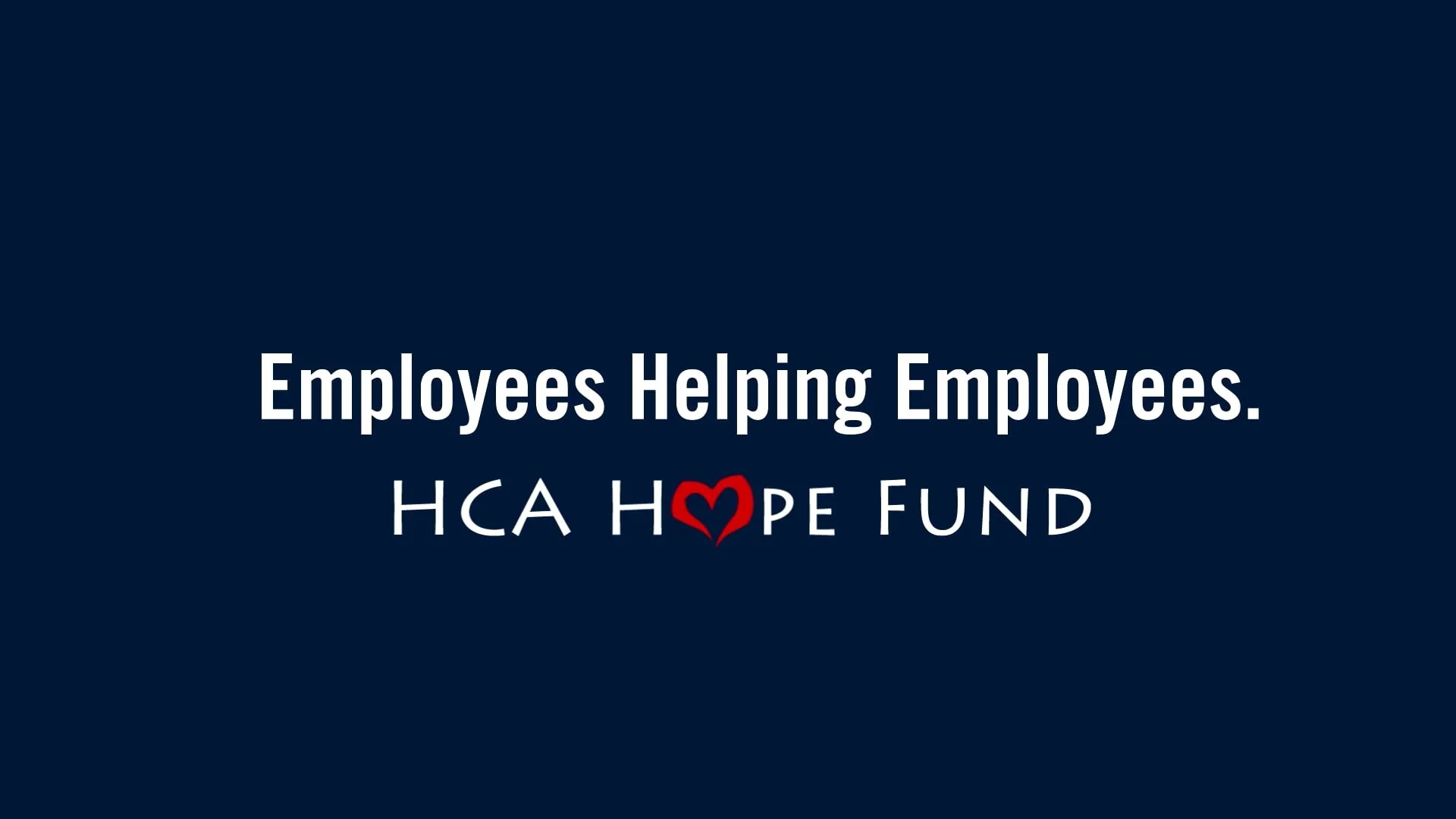
A bridge campaign that kept employee relief visible during corporate rebranding.
THE CHALLENGE
HCA Healthcare was in the middle of a corporate rebrand. The Hope Fund, an internal employee relief program funded entirely by employee donations, had its own established visual identity that employees recognized and trusted.
The Problem: Annual Hope Fund Week needed to happen during the rebrand transition. Corporate wanted brand alignment. The Hope Fund team wanted to protect their program's distinct identity and employee connection. Past campaigns had treated them as completely separate brands, creating visual disconnect.
The campaign needed posters, an infographic, and a video that worked for both stakeholders without compromising either brand or confusing employees.
SCOPE OF WORK
Campaign posters for facility displays
Impact infographic showing donation distribution
30-second video for internal sharing and social
Brand bridge between Hope Fund and corporate identity systems
THE WORK
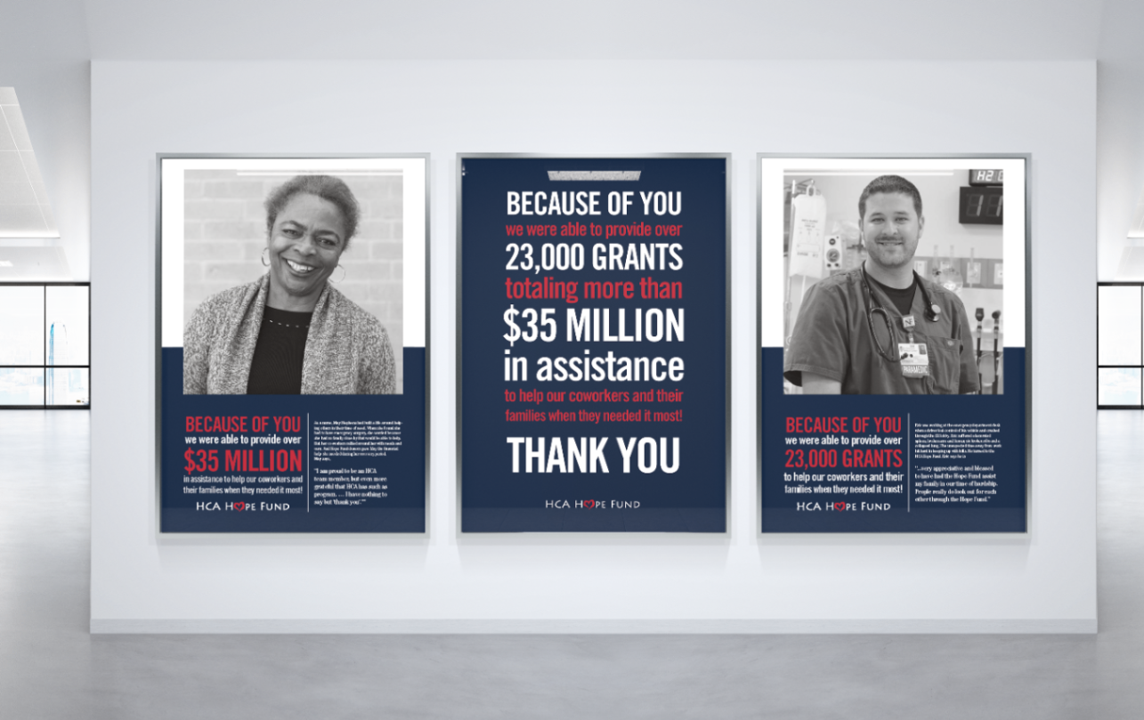
Facility Posters
Real stories from Hope Fund recipients with impact data. Designed for visibility across healthcare facilities.
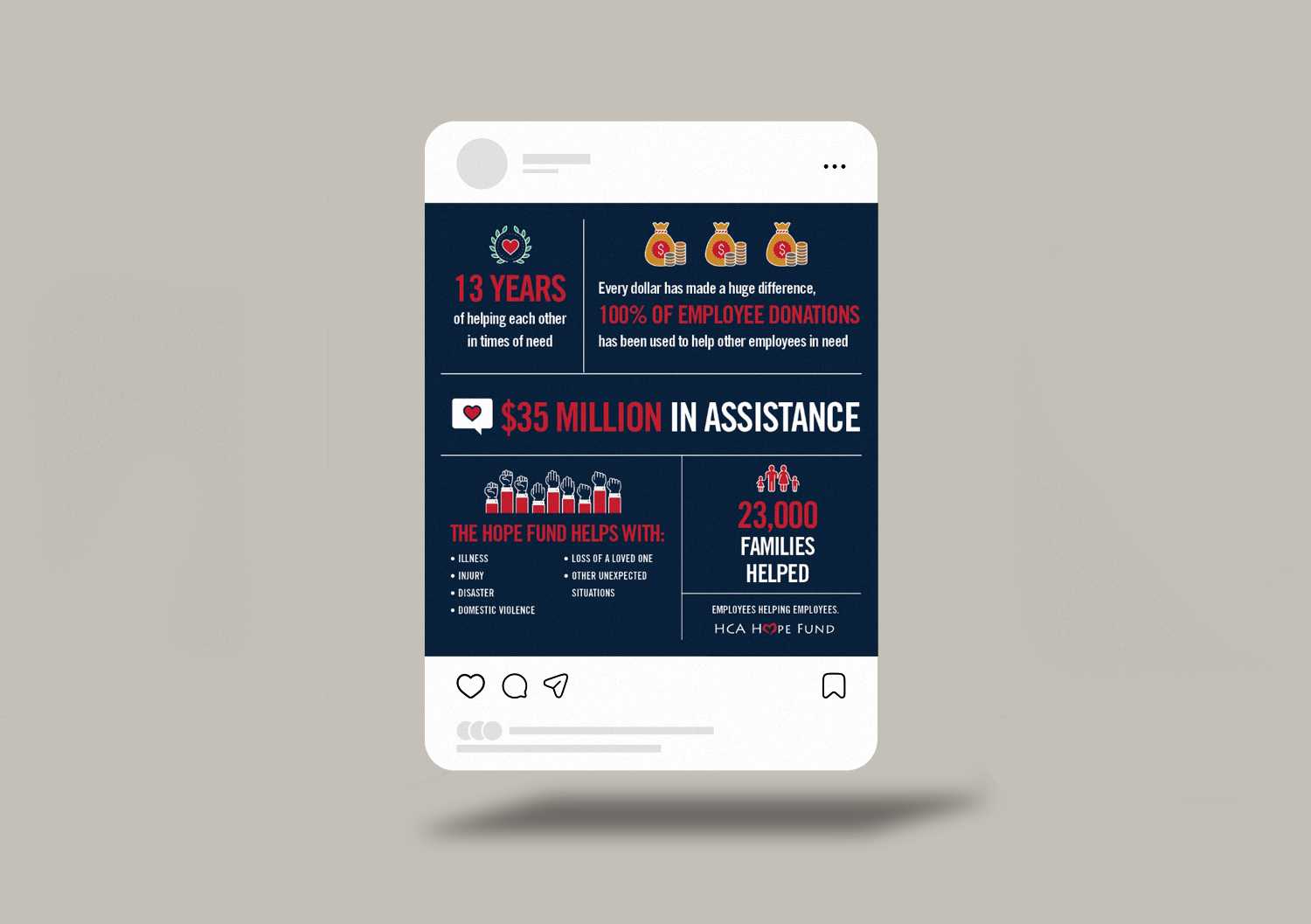
Infographic + Social Content
Data-light, emotionally strong. Built to share internally and across social channels.
30-Second Thank You Video
Text-driven video with key stats and gratitude message. High completion rates, widely shared.

Impact
"This was the first time the Hope Fund felt truly connected to the rest of our brand. You kept the message front and center while making everything feel cohesive, warm, and clear."
The campaign tied two brand identities together without compromising either. Posters displayed across multiple facilities. Video saw strong internal engagement and high completion rates. The work became the reference point for how Hope Fund and corporate brand co-exist visually.
Need Help Navigating Brand Transitions?
FAQs
How do you handle campaigns that bridge multiple brand identities?
We audit both brand systems to identify visual overlap and disconnects, then create a shared visual language that respects each identity while building cohesion.
What's included in an internal campaign project?
Typically campaign identity, multi-format assets (print, digital, video), brand guidelines for the campaign, and templates for future use.
Can you create campaigns for healthcare organizations?
Yes. This campaign ran across HCA Healthcare facilities and required understanding both internal communications and healthcare environments.
How long does a campaign design project take?
Most internal campaigns take 4-6 weeks from kickoff to final deliverables, depending on asset count and complexity.
