Everyone's Wrong About the Cracker Barrel Rebrand (Well, Mostly)
The internet lost its collective mind when Cracker Barrel unveiled their rebrand.
Twitter (sorry, X) roasted the new logo. Facebook comments sections turned into therapy sessions for people mourning the loss of their childhood favorite. Design Twitter did what Design Twitter does: picked it apart with the precision of a surgeon and the mercy of a firing squad.
The backlash reached such a scale that even President Trump commented, urging the company to go back to the old logo.
When a rebrand makes it to that level of publicity, you know something went deeply wrong.
Within a week, Cracker Barrel reversed course entirely. The new logo was gone. Uncle Herschel was back. A survey found that 76% of people who knew about the change preferred the original logo (YouGov, August 2025). Traffic dropped 8% in the month after the announcement (Cracker Barrel earnings call, September 2025).
But here's the thing nobody's talking about: most of the rebrand actually works.
I know, I know. Controversial take. But stick with me.
Why I'm Qualified to Have Opinions on This
Full disclosure: I'm about as qualified to have opinions on Cracker Barrel as anyone gets.
I worked there for 6 years. Started as a line cook, switched to serving when I realized taking art and design classes while working an industrial grill for 40 hours a week is a terrible life choice. I met my husband there (a story for another day). That place got me through undergrad.
So when I say I have thoughts about their rebrand, I'm not just talking as a creative director. I'm talking as someone who lived it.
Recently, I took my family to breakfast and brought my professional eye along for the ride. What I found surprised me.
What Actually Works (That Nobody's Giving Them Credit For)
Let's start with what they got right:
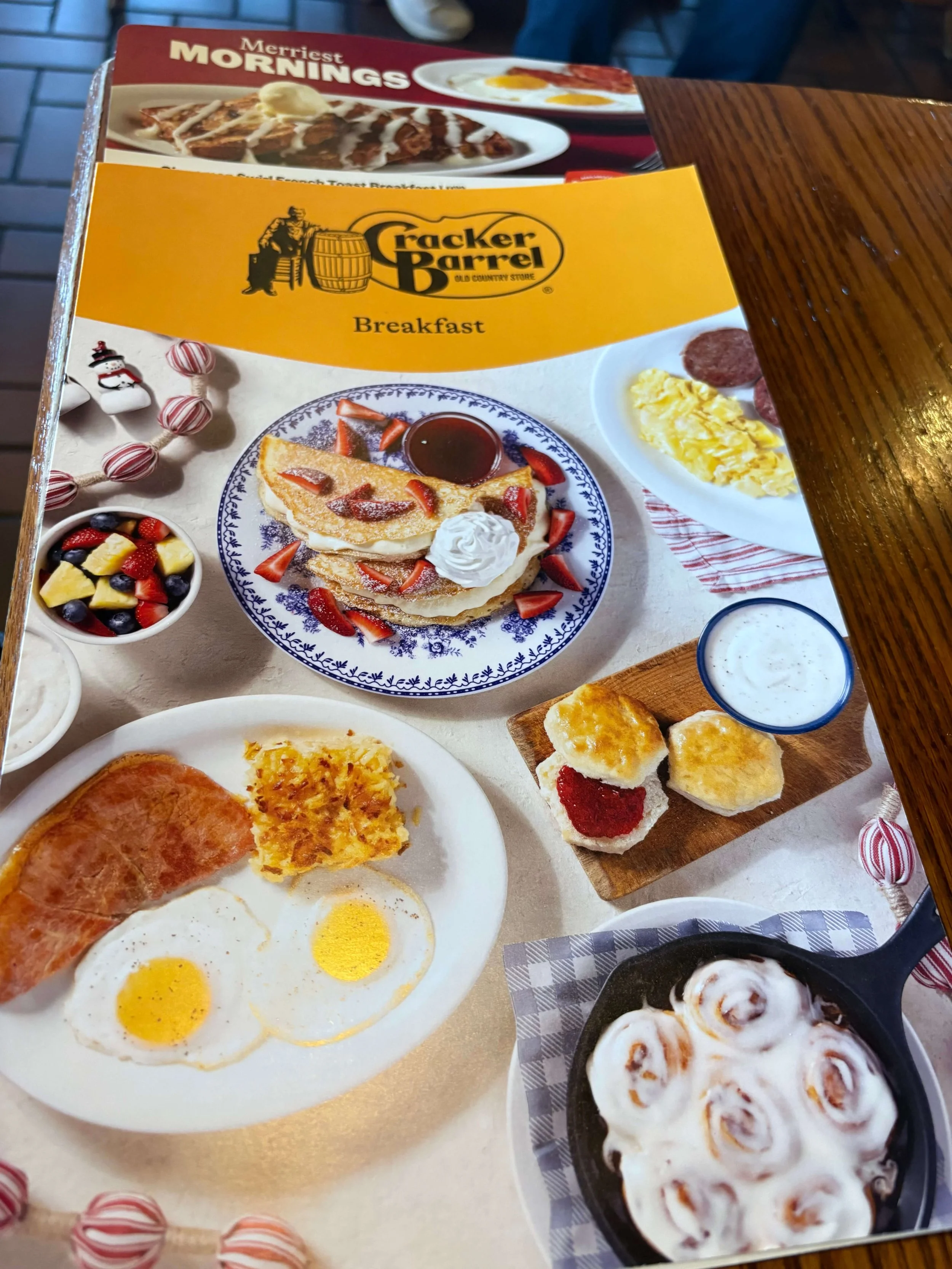
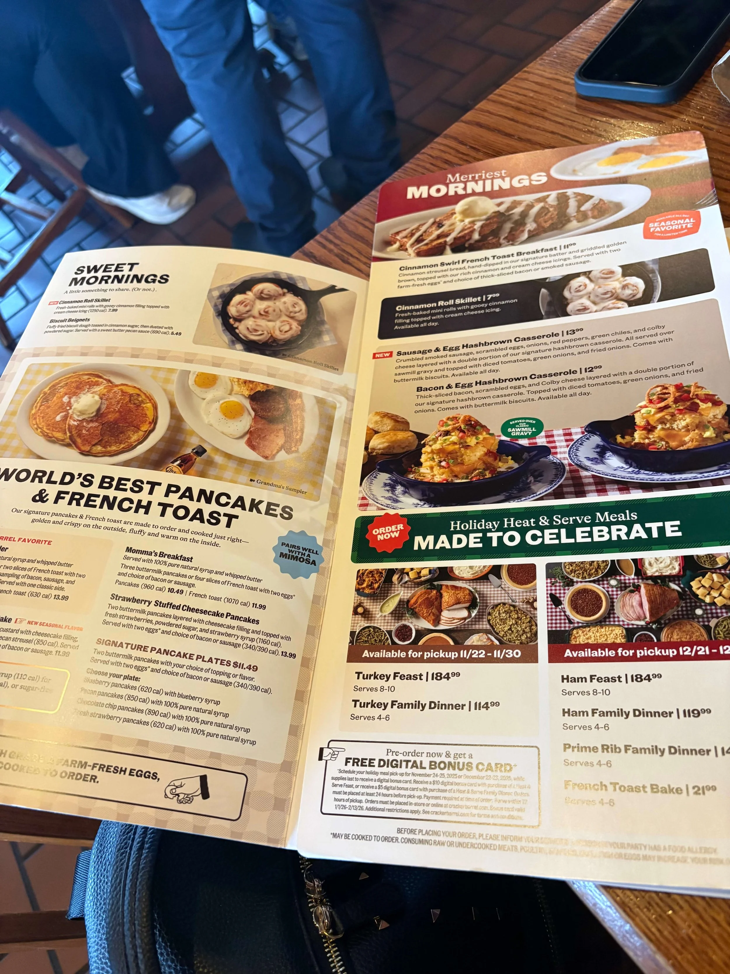
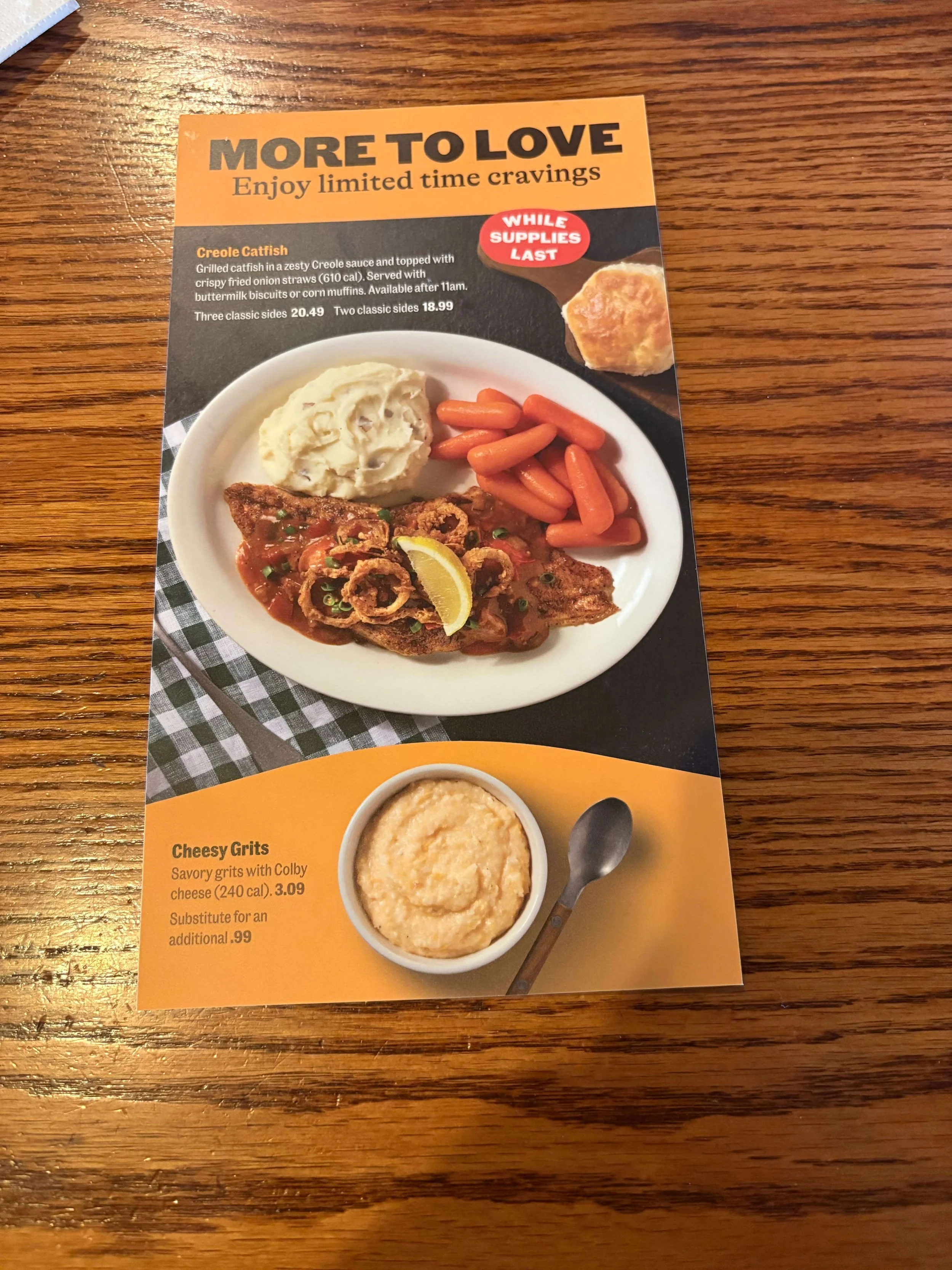
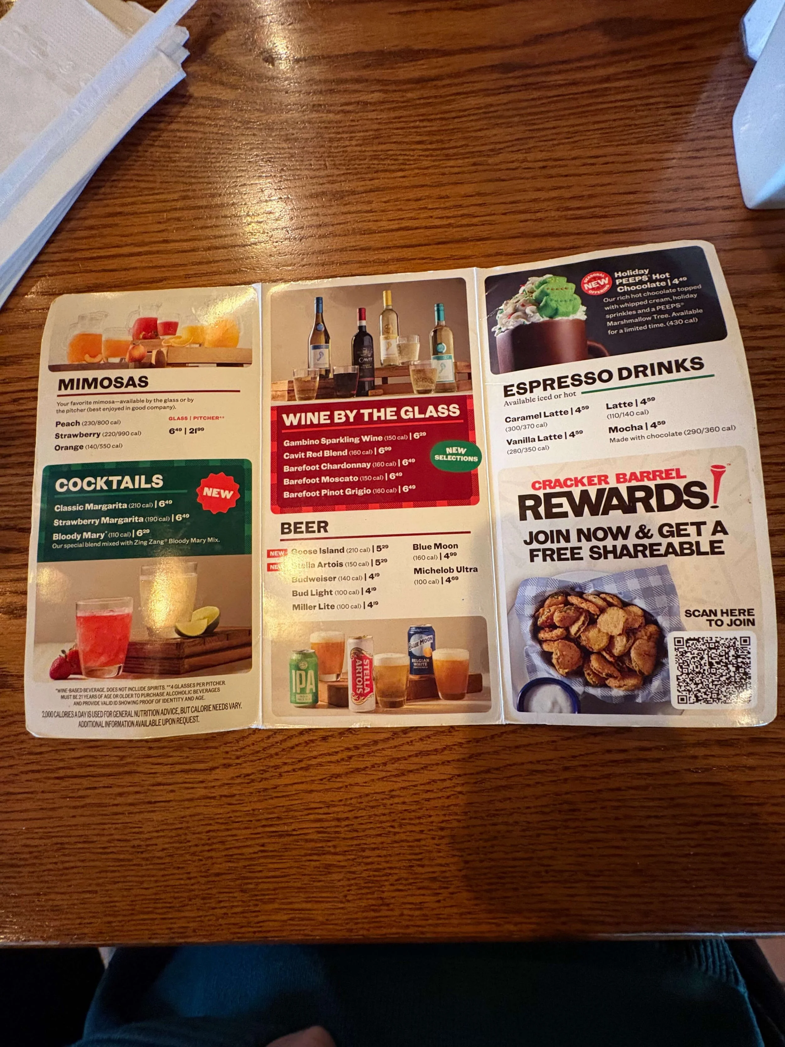
The menu design is clean and functional.
The photography is appetizing without being over-styled. The hierarchy makes sense. You can actually find what you're looking for without hunting through a maze of southern metaphors and decorative fonts.
The promotional materials have a cohesive system.
The "More to Love" limited-time offerings? The seasonal meal promotions? They feel like they belong to the same brand family. That's harder than it sounds.
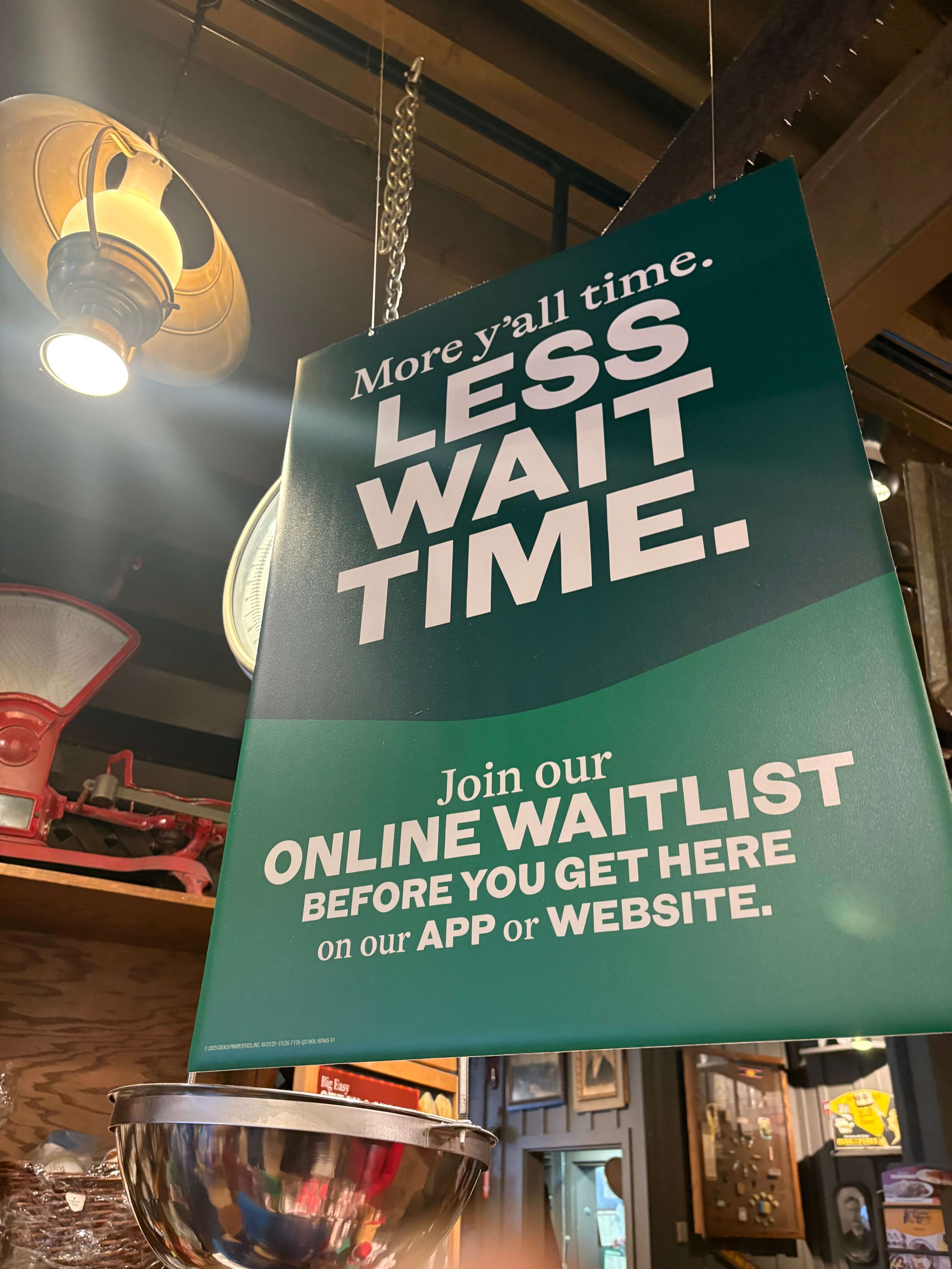
The in-store signage works.
"More y'all time. Less wait time." Is this copywriting going to win an award? Probably Not. But it's clear, on-brand, and solves a real customer problem. Nobody likes waiting 45 minutes for biscuits, even if they're incredible.
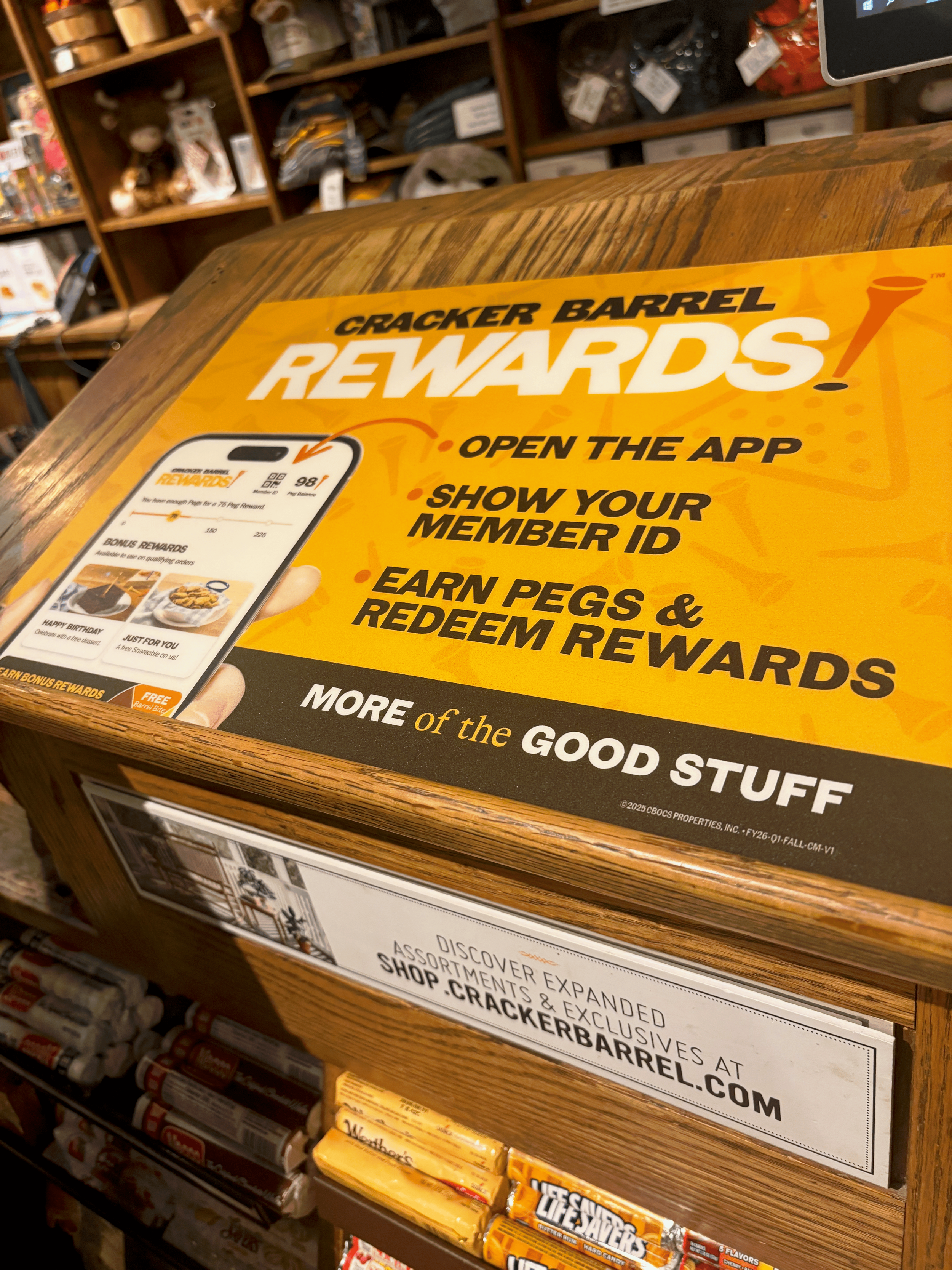
The rewards program materials are straightforward.
No overly corp or industry-speak here. Just "scan here, get rewards." Revolutionary.
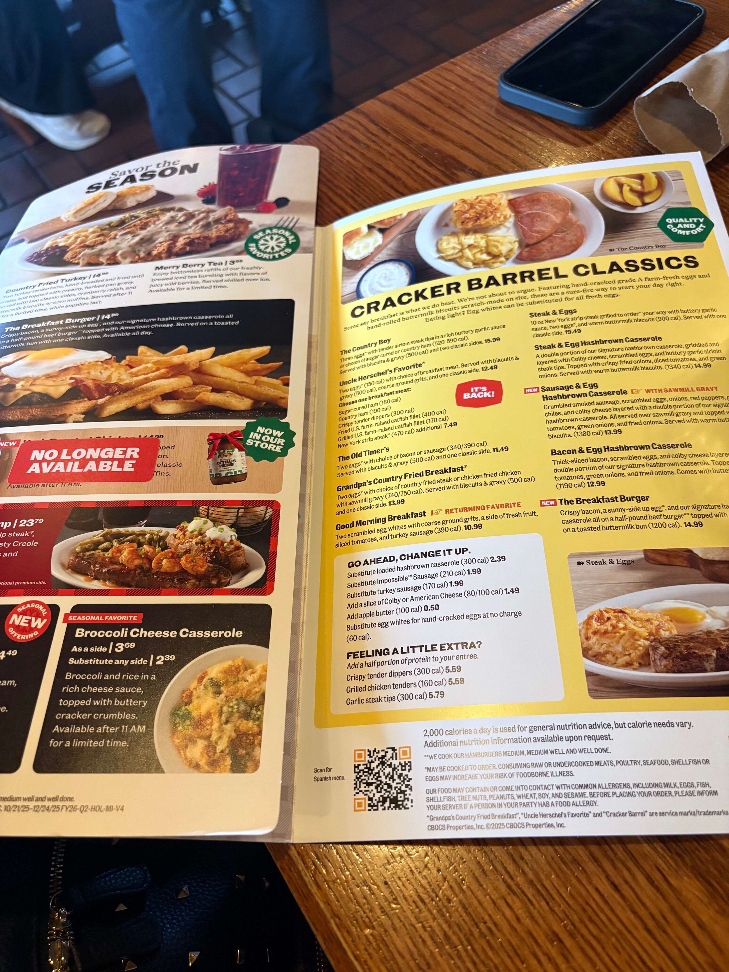
Are there issues? Absolutely. The leading in some of the body copy is inconsistent. There are sections with dead space that could've been tightened up. But these are executional details, not strategic failures.
The bones are good. The system works. It's just the logo that everyone hates.
The Real Problem: Design in a Vacuum
Here's where it gets interesting.
The rebrand was handled by Prophet, a San Francisco-based design firm. Nothing wrong with that on paper. Great talent in that city, obviously. But it explains everything about why this landed the way it did.
You cannot rebrand Cracker Barrel from a coastal office and expect to nail the cultural nuances. You just can't.
This isn't about design skill. It's about cultural fluency.
Cracker Barrel isn't just a restaurant chain. For millions of southerners, it's a core memory. It's road trips and Sunday lunches and that weird gift shop with the overpriced candy and the wooden toys nobody actually buys but everyone loves anyway.
The brand has 50+ years of equity baked into every table set of peg games and rocking chair on the front porch. You don't redesign that logo without understanding what it means to people.
And the data backs this up. When customers were asked what Cracker Barrel should prioritize, 37% said preserving the "country store" heritage was most important. Only 7% wanted the brand to focus on attracting younger customers (YouGov, August 2025). The entire rebrand strategy was built around that 7%.
And this is where I find it darkly amusing.I moved from the coast to the south. I've lived both sides of this cultural divide. And watching coastal folx consistently underestimate southern audiences never gets old.
It's not malicious. It's just... myopic. There's also an assumption that "updating" a brand means making it look like every other modern casual dining brand. Clean sans-serifs. Minimal. Contemporary.
But Cracker Barrel's entire value proposition is that it's not contemporary. It's deliberately nostalgic. That's the whole point.
What This Teaches Us About Heritage Brands
If you're thinking about rebranding (or working on one for a client), here's what Cracker Barrel's experience teaches us:
Brand equity is real, and it's powerful.
You don't get to decide what people are attached to. They do. Ignore that at your peril.
Cultural context matters more than design excellence.
You can execute flawlessly and still miss the mark if you don't understand your audience on a deeper level.
Systems can work even when a single element fails.
Cracker Barrel's menu design and promotional materials are genuinely good work. The logo controversy doesn't erase that.
Distance from your audience is dangerous.
If your entire creative team lives in a bubble removed from your customer base, you're going to miss things. Important things.
Sometimes "modern" isn't the answer.
Not every brand needs a minimalist sans-serif logo and a monochromatic color palette. Some brands should feel like grandma's house, because that's their positioning.
Test before you commit.
The redesigned restaurant interiors were rolled out to just 4 locations out of 660 before being suspended (Multiple outlets, October 2025). More testing might have caught the disconnect before it became a national story.
The Verdict
Was the Cracker Barrel rebrand a disaster?No.
Was the logo a misstep? Based on customer reaction? Yes.
Did they execute a cohesive brand system across their materials? Actually, yes.
The lesson here isn't "don't rebrand heritage brands." It's "understand what you're working with before you start changing things."
Good design isn't just about making things look good. It's about making them work for the people who use them. In the context they actually exist in. With an understanding of what they mean, not just what they look like.
Cracker Barrel got some of this right. The execution of their system is solid. But the logo (the most visible, most symbolic piece) that's where they lost the plot.
And that's what everyone remembers.
The Takeaway
Not every brand problem requires burning it down and starting over. Sometimes you need a refresh. Sometimes you need a full rebuild. But you always need to understand what you're working with before you change it.
The key to knowing which path you're on? Start with understanding what your brand means to the people who actually use it. Not what you think it should mean. Not what looks good in your portfolio. What it actually means.
It's easy to beautify things when you're standing back far enough. It's harder to make them work when you're standing right where your customers are.
Get close enough to actually hear them. Then do the work.
If you're not sure whether your own brand is evolving intentionally or just drifting, start with the FifthHouse Brand Audit Worksheet. It takes about 20 minutes and tells you more than most brand conversations do.
Sources Cited:
YouGov, "Americans push back on Cracker Barrel's logo rebrand," August 2025
Multiple news outlets including CNN, ABC News, Fox Business, October 2025
